
データ解析をする際, データの特徴を把握するためには図示するのが一番.
そこでこの記事では二変数の関係を把握するための図示の仕方をpandasを用いて行なっていく. データの型別のplotとして以下のものを紹介する.
- 連続 to 連続 -> scatter plot
- カテゴリカル to 連続 -> box plot (箱ひげ図)
- カテゴリカル to カテゴリカル -> stacked bar plot
- 連続 to カテゴリカル -> stacked area chart
また, この記事ではデータを収集した段階での状態から図示していく方法について記述していく.
この記事のコードはjupyter notebook上での動作していることは確認している.
準備
用いるデータは以下の example_data.xlsx を用いる.
以下のコードを最初に回しておく.
matplotlibは日本語対応していないので, 日本語のフォントを導入する. (設定の仕方については, 他のサイトで調べてください. )
import pandas as pd
import numpy as np
import matplotlib.pyplot as plt
%matplotlib inline
import seaborn as sns
sns.set(context="paper" , style ="whitegrid",rc={"figure.facecolor":"white"})

plt.rcParams['font.family'] = 'IPAPGothic' #全体のフォントを設定

file = "example_data.xlsx"
x1 = pd.ExcelFile(file)
df = x1.parse("Sheet1")
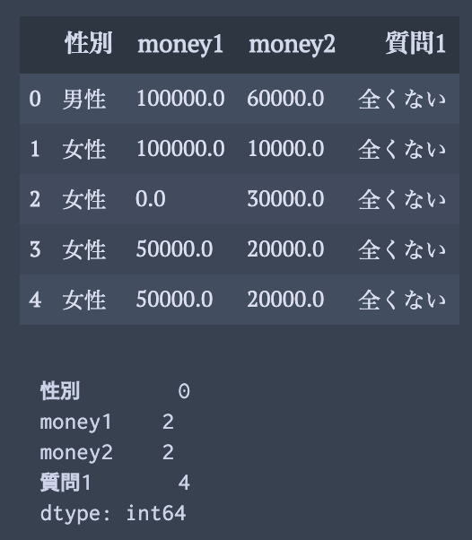
データは以下のようになっている.
グラフの作成の種類によって, 欠損データの取り扱いが微妙に異なっていることに注意されたい.
display(df.head())
print(df.isnull().sum())
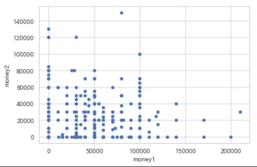
連続 to 連続 -> scatter plot
一行で実現可能
df.plot(x= "money1",y = "money2",kind="scatter")
カテゴリカル to 連続 -> box plot (箱ひげ図)
こちらも一行で実現可能だが, 図の大きさを調整出来るような方法で書く.
pandasのplot機能とseabornを用いた場合の2パターンを載せる.
fig = plt.figure(figsize=(7,5),dpi=100)
ax = fig.add_subplot(111)
df.boxplot(column=["money1","money2"],by="性別",ax = ax)
plt.suptitle("Title")
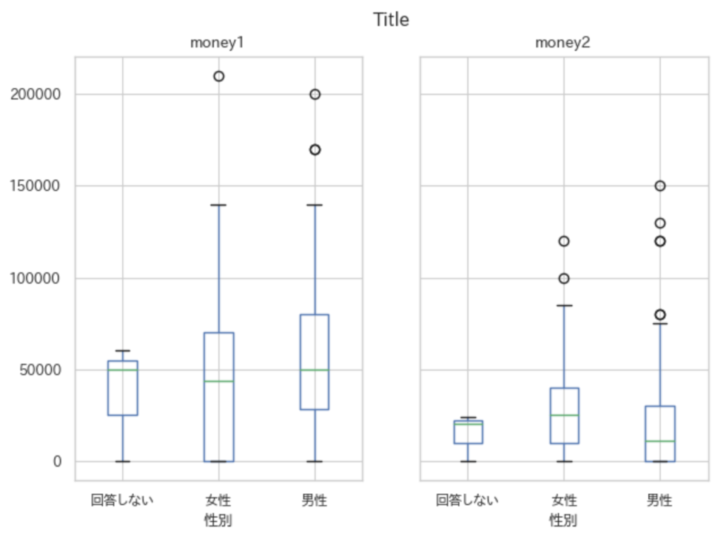
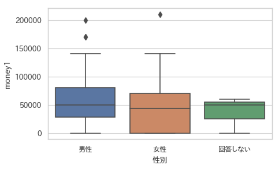
fig = plt.figure(figsize=(5,3),dpi=100)
ax = fig.add_subplot(111)
sns.boxplot(x="性別",y="money1",data=df,ax = ax)
plt.show()
箱ひげ図のヒゲのつく位置について.
matplotlibのofficial documentのboxplotのページ(matplotlib.pyplot.boxplot )をみると引数のwhisの部分にこう書かれている.
whis : float, sequence, or string (default = 1.5)
As a float, determines the reach of the whiskers to the beyond the first and third quartiles. In other words, where IQR is the interquartile range (Q3-Q1), the upper whisker will extend to last datum less thanQ3 + whis*IQR). Similarly, the lower whisker will extend to the first datum greater thanQ1 - whis*IQR. Beyond the whiskers, data are considered outliers and are plotted as individual points. Set this to an unreasonably high value to force the whiskers to show the min and max values. Alternatively, set this to an ascending sequence of percentile (e.g., [5, 95]) to set the whiskers at specific percentiles of the data. Finally,whiscan be the string'range'to force the whiskers to the min and max of the data.
これを確かめるために以下のようなコードを回して確認してみる.
data1 = [i for i in range(1,11)] + [20]
data2 = [i for i in range(1,11)] + [16]
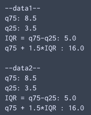
print("--data1--")
q75, q25 = np.percentile(data1, [75 ,25])
print("q75: %.1f nq25: %.1f nIQR = q75-q25: %.1f nq75 + 1.5*IQR : %.1fn" %(q75,q25,q75-q25,q75+ 1.5*(q75-q25)) )
print("--data2--")
q75, q25 = np.percentile(data2, [75 ,25])
print("q75: %.1f nq25: %.1f nIQR = q75-q25: %.1f nq75 + 1.5*IQR : %.1fn" %(q75,q25,q75-q25,q75+ 1.5*(q75-q25)) )
plt.boxplot([data1,data2])
出力は以下の通り.
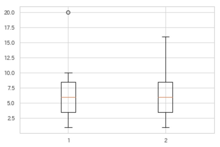
引用文の中では less than と言っているが, Q3 + whis*IQR ぴったりの点でも外れ値として処理されないようだ.
カテゴリカル to カテゴリカル -> stacked bar plot
これは少しめんどくさい. というのも, pandasに用意されているbar plotの機能はクロス集計されたものをplotする機能でしかないから, 自分でクロス集計しなければいけない. これは, .pivot_tableを使うと簡単に出来る.
何回も様々な変数の組に使えるように, 関数として用意する.
引数によって, カウントか率, 水平か垂直, を選べるようにした.
def crossTabulationPlot(df_,ind_,col_,val = "count",per=False,kind="bar"):
fig = plt.figure(figsize=(5,3),dpi=100)
ax = fig.add_subplot(111)
dfM = df_.copy()
dfM["count"] = 1
dfM = dfM.pivot_table(index = ind_,columns = col_,values=val,aggfunc=np.sum)
# percentage or count
if per:
dfM = dfM.T.div(dfM.T.sum()).T*100
# kind of barplot type: horizontal or vertical
if kind =="bar":
dfM.plot(kind="bar",stacked=True,ax=ax,rot =30)
else:
kind =="barh"
dfM.plot(kind="barh",stacked =True,ax=ax)
ax.legend(bbox_to_anchor=(1.01, 0.98), loc='upper left', borderaxespad=0, fontsize=8,)
if per:
ax.set_xlabel("percent")
else:
ax.set_xlabel("count")
ax.set_title(col)
plt.show()
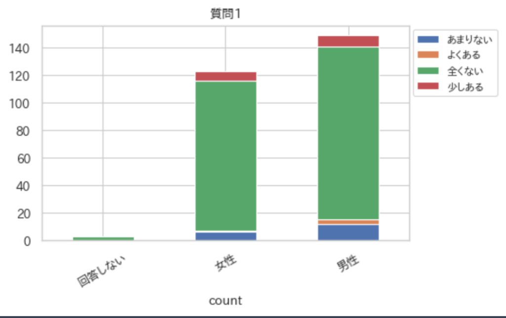
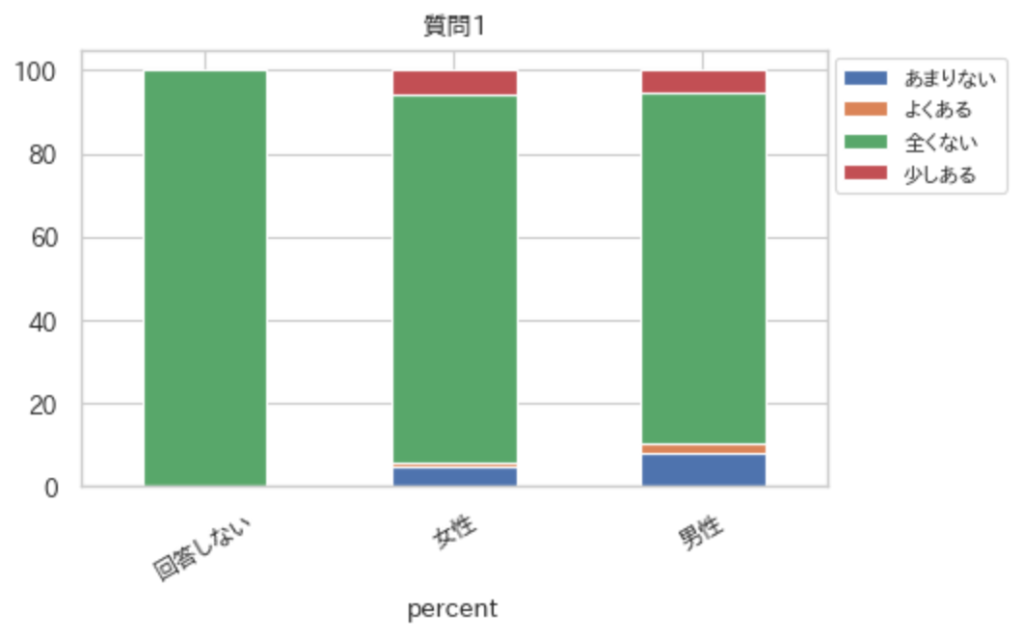
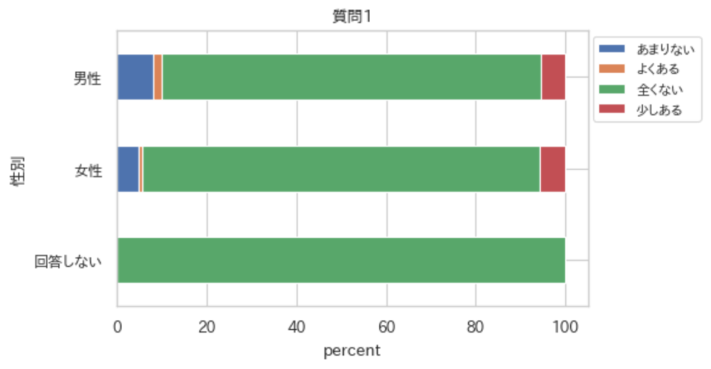
ind = "性別"
col = "質問1"
crossTabulationPlot(df,ind,col)
crossTabulationPlot(df,ind,col,per=True)
crossTabulationPlot(df,ind,col,per=True,kind="barh")
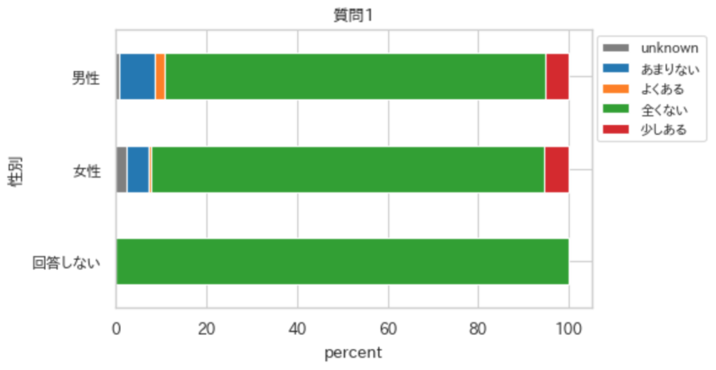
注意して欲しいのは, 上記の関数だと欠損データ(np.nan)が無視されて集計される. そこで, 欠損データをunknownとして集計し, かつunknownは常に暗い色で表示されるようにする.
def crossTabulationPlot(df_,ind_,col_,val = "count",per=False,kind="bar"):
    fig = plt.figure(figsize=(5,3),dpi=100)
    ax = fig.add_subplot(111)

    dfM = df_.copy()
    dfM["count"] = 1
    dfM[col] = dfM[col].replace(np.nan,"uniknown")
    dfM = dfM.pivot_table(index = ind_,columns = col_,values=val,aggfunc=np.sum)
    # percentage or count
    if per:
        dfM = dfM.T.div(dfM.T.sum()).T*100

    # color setting
    keys = dfM.keys()
    N =len(keys)
    if N > 10:
        cm = plt.get_cmap("tab20")
        step = 0.05
    else:
        cm = plt.get_cmap("tab10")
        step= 0.1
    c = []
    ind = 0.05
    for i in range(N):
        if keys[i] == "unknown":
            c.append(cm(0.7))
            continue
        if 0.7 <= ind and ind < 0.8:
            ind += 0.1
        c.append(cm(ind))
        ind += step

    # kind of barplot type: horizontal or vertical
    if kind  =="bar":
        dfM.plot(kind="bar",stacked=True,ax=ax,rot =30,color =c)
    else:
        kind =="barh"
        dfM.plot(kind="barh",stacked =True,ax=ax,color=c)

    ax.legend(bbox_to_anchor=(1.01, 0.98), loc='upper left', borderaxespad=0, fontsize=8,)
    if per:
        ax.set_xlabel("percent")
    else:
        ax.set_xlabel("count")
    ax.set_title(col_)
    plt.show()

ind = "性別"
col = "質問1"
crossTabulationPlot(df,ind,col,per=True,kind="barh")
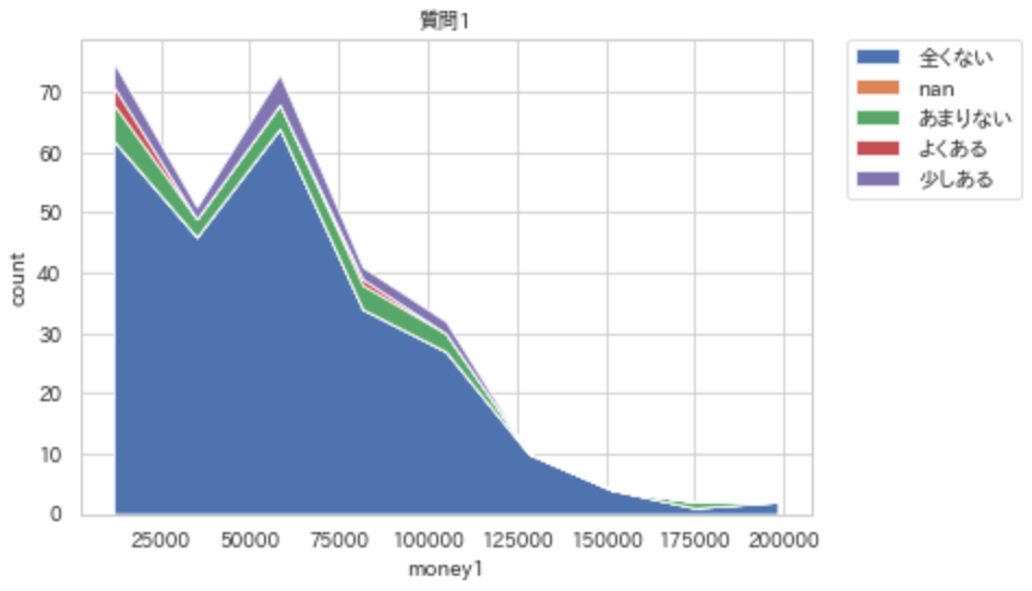
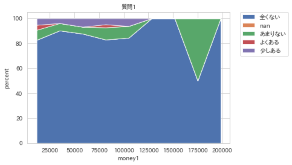
連続 to カテゴリカル -> stacked area chart
ここで紹介する関数は, 適当な位置で連続を切ってカテゴリカルな変数に直して表示している. そのため, カテゴリカル to カテゴリカルのようにstacked bar plotで表示する方が, どこで切ったか明確になるため, 図としては適切である. だが, ここでは2変数の特徴を捉えるために, 適宜, 分割の幅を変えて結果を観察し, 傾向を捉えやすいstacked area chartでの図示を紹介する.
def stacked_area_chart(x_nm,y_nm,df ,y_cat = False,n_divide =10,per = False):
    df_ = df.copy()
    if y_cat:
        dammy =1
    else:
        y_cat = df_[y_nm].dropna().unique()
    df_["count"] = 1
    bins = np.linspace(df_[x_nm].min(),df_[x_nm].max(),n_divide)
    pos = [ ( bins[i+1]+ bins[i])/2 for i in range(len(bins)- 1)]

    height = {}
    for key in y_cat:
        height[key] = []
    for i in range(len(bins)- 1 ):
        l = bins[i]
        h = bins[i+1]
        df__m = df_[(df_[x_nm] >= l)  & (df_[x_nm] < h + 0.0001)  == 1]
        macro = df__m.groupby(y_nm).sum()["count"]
        if per :
            macro = macro.divide(macro.sum())*100
        for key in y_cat:
            if key in macro.keys():
                height[key].append( macro[key] )
            else:
                height[key].append(0)

    data = []
    for n in y_cat:
        data.append(height[n])
    plt.stackplot(pos,data  , labels=y_cat)
    plt.legend(bbox_to_anchor=(1.05, 1), loc='upper left', borderaxespad=0, fontsize=10)
    plt.xlabel(x_nm)
    if per:
        plt.ylabel("percent")
    else:
        plt.ylabel("count")
    plt.title(y_nm)
    plt.show()


stacked_area_chart(x_nm="money1",y_nm="質問1",df=df)
stacked_area_chart(x_nm="money1",y_nm="質問1",df=df,per=True)
参考文献
・Python pandas プロット機能を使いこなす, http://sinhrks.hatenablog.com/entry/2015/11/15/222543
・pandas.DataFrame.boxplot, https://pandas.pydata.org/pandas-docs/stable/reference/api/pandas.DataFrame.boxplot.html
・matplotlib.pyplot.boxplot , https://matplotlib.org/3.1.1/api/_as_gen/matplotlib.pyplot.boxplot.html
----------雑感(`・ω・´)----------
図示って基本的で, 非常に大切. 外すべきではない方法だけれども意外とめんどくさい. ここで紹介した方法で大抵の二変数の関係は処理できるはず.
ただ, この図示によって見える関係が, 因果関係がないけれども生じている可能性があるので(ただの偶然, 交絡因子, 因果関係が逆, collision biasなど), 追加の分析は必要になる.
多変数の関係に関しては, 主成分分析とk-means clusteringの組み合わせで眺めると良い.

コメント