
データに対してk means clusteringをかけて, その結果が妥当であるかどうかをPCA(Principal Component Analysis)を用いて図示する. 図示を2次元と3次元で行う方法を紹介する. 使う言語はpythonで, kmeans clusteringとPCAはscikit learnを用いる.
準備
動作は, jupyter notebook上を想定している.
import pandas as pd
import numpy as np
import matplotlib.pyplot as plt
%matplotlib inline
import seaborn as sns
sns.set(context="paper" , style ="whitegrid",rc={"figure.facecolor":"white"})

from sklearn.cluster import KMeans
from sklearn.decomposition import PCA
# for sample data
from sklearn import datasets
# for plot
import matplotlib.patches as mpatches
from mpl_toolkits.mplot3d import Axes3D
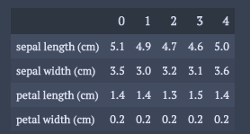
データはirisを用いる.
ただ, 実際の解析に近づけるためにpandasのformsの構造に変形しておく.
dataset = datasets.load_iris()
dic = {}
for k,v in zip(dataset.feature_names,dataset.data.T):
    dic[k] = v
df = pd.DataFrame(dic)
df.head().T
解析パート
scikit learnを用いれば解析自体は簡単に実装可能.
PCAでの各成分の寄与率の大きさを解釈可能にするためにデータを正規化する.
varNames = df.columns
# normalization
dfScaled = df.copy()[varNames]
dfScaled = (dfScaled - dfScaled.mean())/dfScaled.std()
k means clusteringとPCAの実行.
# k-means clustering
nClusters = 4
nInit = 30
randomState = 4

pred = KMeans(n_clusters=nClusters,n_init=nInit,random_state=randomState).fit_predict(dfScaled[varNames])
dfScaled["clusterId"] = pred

# principal components analysis
pca = PCA(n_components=3)
trans= pca.fit_transform(dfScaled[varNames])
注意事項としては, k means clusteringをかけた後では, dfScaledに”clusterID”のデータが入ってきているので, PCAをかける際にその成分を含まないようにすること.
2次元でk means clusteringの結果確認
この章で紹介するのは次の3つ.
・各次元の寄与率, 累積寄与率, 各変数ごとの各次元への成分値の表示
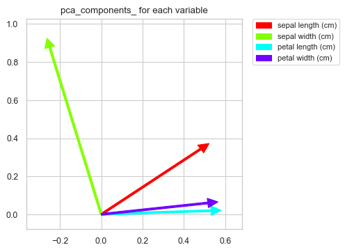
・各変数ごとの各次元における成分値の図示
・2次元でクラスごとのデータの位置を図示
これらをみるために次の3つの関数を準備する.
def summaryPCA(pca_,cols):
    print('各次元の寄与率: {0}'.format(pca_.explained_variance_ratio_))
    print('累積寄与率: {0}'.format(sum(pca_.explained_variance_ratio_)))
    print("pca components")
    for k,v in zip(cols,pca_.components_.T):
        print(k,":",", ".join(["%2.2f"%i for i in v]))


def contriPCAPlot(pca_,cols):
    c_p = pca_.components_[:2]

    fig = plt.figure(figsize=(4,4),dpi=100)
    ax = fig.add_subplot(111)
    ax.set_xlim([np.min(c_p[0] + [0])-0.1,np.max(c_p[0]) + 0.1])
    ax.set_ylim([np.min(c_p[1]+[0])-0.1,np.max(c_p[1])+0.1])
    # colormap setting
    cm = plt.get_cmap("hsv")
    c = []
    n_ = len(c_p[0])
    for i in range(n_):
        c.append(cm(i/n_))

    for i, v in enumerate(c_p.T):
        ax.arrow(x=0,y=0,dx=v[0],dy=v[1],width=0.01,head_width=0.05,
                  head_length=0.05,length_includes_head=True,color=c[i])
    # legend setting
    patch = []
    for i in range(n_):
        patch.append(mpatches.Patch(color=c[i], label=cols[i] ))
    plt.legend(handles=patch,bbox_to_anchor=(1.05, 1), loc='upper left', borderaxespad=0, fontsize=8)
    ax.set_title("pca_components_ for each variable")
    plt.show()


def clusterPCAPlot(trans_,df_):
    fig = plt.figure(figsize=(6,4),dpi=100)
    ax = fig.add_subplot(111)
    for i in range(len(df_["clusterId"].unique())):
        ax.scatter(trans_[df_["clusterId"]==i,0],trans_[df_["clusterId"]==i,1])
    plt.legend(df_["clusterId"].unique())
    plt.show()
それぞれの結果の確認.
summaryPCA(pca,varNames)
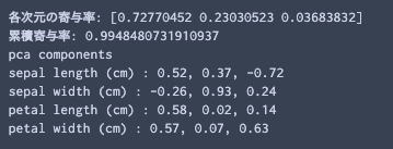
累積寄与率は, 第3成分までの和であることに注意.
次に, 各変数ごとの各次元における成分値の図示
contriPCAPlot(pca,varNames)
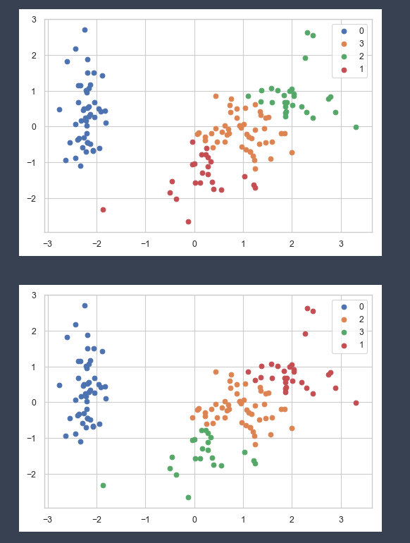
2次元でクラスごとのデータの位置を図示
clusterPCAPlot(trans,dfScaled)
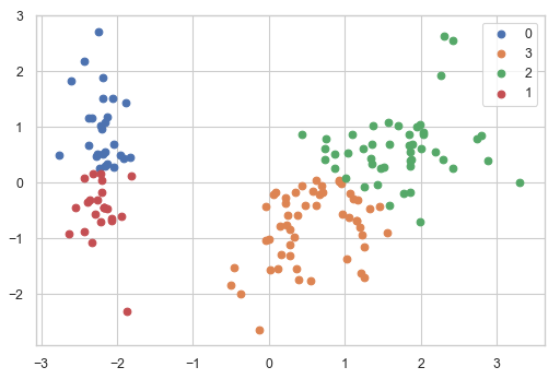
冗長ではあるが, k means clusteringが, いかに局所解に陥りやすいかを確認するのは意味があると思う. 冒頭のk means clusteringでは30回初期値を変えて, 一番成績の良かった組を結果として返している.
以下のコードで初期値一つに対して一つの結果を返してくれる. irisデータでさえ結果は安定しないことが分かる.
df_ = dfScaled.copy()
for i in range(10):
    nClusters = 4
    nInit = 1
    pred = KMeans(n_clusters=nClusters,n_init=nInit,random_state=i).fit_predict(df_[varNames])
    df_["clusterId"] = pred
    clusterPCAPlot(trans,df_)
3次元でk means clusteringの結果確認
3次元だとコードが長くなるので, コードは後に掲載した.
それぞれの関数で何が出来るかだけみていく.
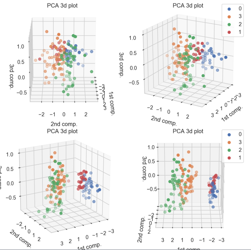
以下の関数では, 3次元でクラスごとのデータの位置を図示する. みやすさのため, 同じ結果を30度ずつ傾けて表示している.
clusterPCA3dPlot(trans,dfScaled)
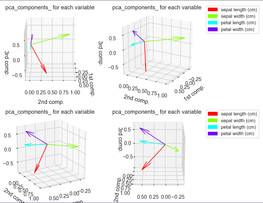
3次元での各変数ごとの各次元における成分値の図示
contriPCAPlot3d(pca,varNames)
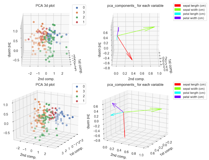
角度ごとに上記二つを組み合わせた図.
clusterPCAContri3dPlot(pca,dfScaled,trans,varNames)
3次元での図示で使用したコード
一つ前の章で使用したコード.
def clusterPCA3dPlot(trans_,df_):
    fig = plt.figure(figsize=(6,6),dpi=150)
    for k in range(1,5):
        ax = fig.add_subplot(2,2,k, projection='3d')
        for i in range(len(df_["clusterId"].unique())):
            cond = df_["clusterId"]==i
            ax.scatter(trans_[cond,0],trans_[cond,1],trans_[cond,2])

        ax.view_init(elev=20., azim=(k-1)*30)
        ax.set_title("PCA 3d plot")
        ax.set_xlabel("1st comp.")
        ax.set_ylabel("2nd comp.")
        ax.set_zlabel("3rd comp.")
        if k in (2,4):
            ax.legend(df_["clusterId"].unique())


    plt.tight_layout()
    plt.show()

def contriPCAPlot3d(pca_,cols):
    c_p = pca_.components_[:3]

    fig = plt.figure(figsize=(6,6),dpi=150)
    for k in range(1,5):
        ax = fig.add_subplot(2,2,k,projection="3d")
        ax.set_xlim([np.min(c_p[0] + [0])-0.1,np.max(c_p[0]) + 0.1])
        ax.set_ylim([np.min(c_p[1]+[0])-0.1,np.max(c_p[1])+0.1])
        ax.set_zlim([np.min(c_p[2]+[0])-0.1,np.max(c_p[2])+0.1])
        # colormap setting
        cm = plt.get_cmap("hsv")
        c = []
        n_ = len(c_p[0])
        for i in range(n_):
            c.append(cm(i/n_))

        for i, v in enumerate(c_p.T):
            ax.quiver(0,0,0,v[0],v[1],v[2],lw=1,color=c[i])

        if k in (2,4) :
            # legend setting
            patch = []
            for i in range(n_):
                patch.append(mpatches.Patch(color=c[i], label=cols[i] ))
            ax.legend(handles=patch,bbox_to_anchor=(1.05, 1), loc='upper left', borderaxespad=0, fontsize=8)

        ax.set_title("pca_components_ for each variable")
        ax.set_xlabel("1st comp.")
        ax.set_ylabel("2nd comp.")
        ax.set_zlabel("3rd comp.")
        ax.view_init(elev=20., azim=(k-1)*30)
    #plt.tight_layout()
    plt.show()

def clusterPCAContri3dPlot(pca_,df_,trans_,cols):
    c_p = pca_.components_[:3]

    fig = plt.figure(figsize=(8,12),dpi=150)
    for k in range(1,5):
        ###### scatter plot part ######
        ax = fig.add_subplot(4,2,2*k -1, projection='3d')
        for i in range(len(df_["clusterId"].unique())):
            cond = df_["clusterId"]==i
            ax.scatter(trans_[cond,0],trans_[cond,1],trans_[cond,2])

        ax.view_init(elev=20., azim=(k-1)*30)
        ax.set_title("PCA 3d plot")
        ax.set_xlabel("1st comp.")
        ax.set_ylabel("2nd comp.")
        ax.set_zlabel("3rd comp.")
        ax.legend(df_["clusterId"].unique())

        ###### contribution arrow part ######
        ax = fig.add_subplot(4,2,2*k,projection="3d")
        ax.set_xlim([np.min(c_p[0] + [0])-0.1,np.max(c_p[0]) + 0.1])
        ax.set_ylim([np.min(c_p[1]+[0])-0.1,np.max(c_p[1])+0.1])
        ax.set_zlim([np.min(c_p[2]+[0])-0.1,np.max(c_p[2])+0.1])
        # colormap setting
        cm = plt.get_cmap("hsv")
        c = []
        n_ = len(c_p[0])
        for i in range(n_):
            c.append(cm(i/n_))

        for i, v in enumerate(c_p.T):
            ax.quiver(0,0,0,v[0],v[1],v[2],lw=1,color=c[i])

        # legend setting
        patch = []
        for i in range(n_):
            patch.append(mpatches.Patch(color=c[i], label=cols[i] ))
        ax.legend(handles=patch,bbox_to_anchor=(0.95, 1), loc='upper left', borderaxespad=0, fontsize=8)

        ax.set_title("pca_components_ for each variable")
        ax.set_xlabel("1st comp.")
        ax.set_ylabel("2nd comp.")
        ax.set_zlabel("3rd comp.")
        ax.view_init(elev=20., azim=(k-1)*30)
    plt.tight_layout()
    plt.show()
———-雑感(`・ω・´)———-
改めて, k means clusteringを用いると何グループに分ければ良いかという問題に立ちはだかることを実感した.
混合ガウス分布を変分近似で求めると, 適応度が低いグループが縮退していく現象が起きるので, このアルゴリズムを実装した方が良さそうだなぁと思ったり…(Pattern Recognition and Machine Learningのchapter10.2の内容)

コメント